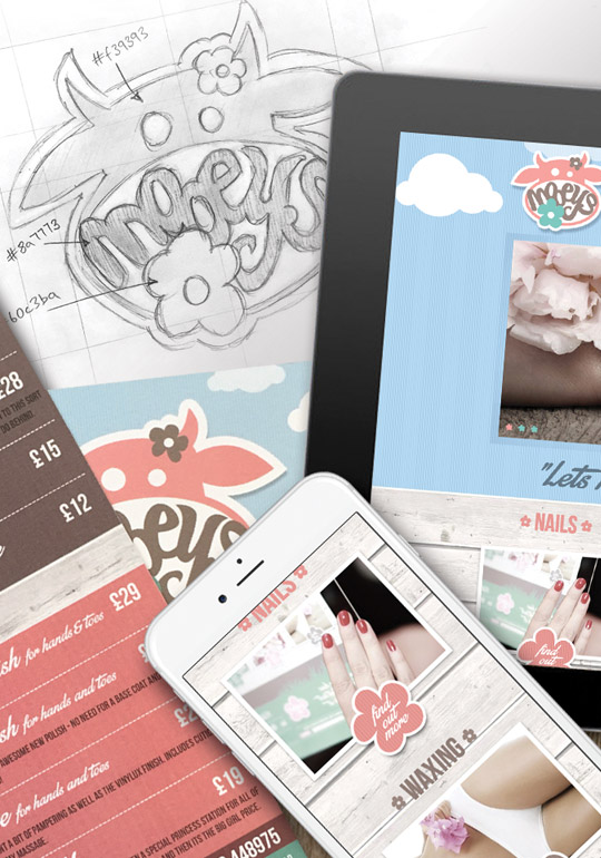
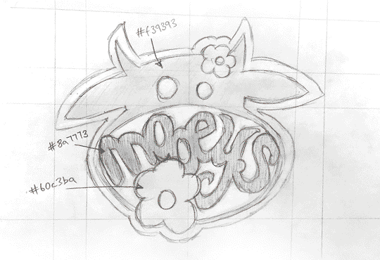
mooeys-logo.png
  • Branding
  • Website
  • Print

When Amy at Mooeys approached us, we instantly knew that this would be a project that we could embrace...and the results were great. The brief of a quirky waxing salon, with a rustic feel allowed our designers to be very creative and think outside of convention for the beauty industry. We built the whole brand identity and website, plus all promotional materials such as price lists, posters etc.

Branding

After a detailed brief from the client on the kind of feel she wanted the brand to represent, we had a good understanding of how to approach the logo design.

Once we had established the core logo design, we experimented with a variety of colour options, and decided to go for earthy pastel tones to meet the clients rustic but quirky brief. 

Website

By embracing the rustic brief and awesome colour palette we now have to work with, the website deign came together quite naturally.

Built fully responsive to work and look great on all devices, we also integrated third party booking software to utilise the full potential of the clients website.

mooeys-medium.jpg
mooeys.gif mooeys-small.jpg
they actually give a damn!
From the moment I had the privilege of working with Aptitude, my brand evolved. They gave me advice, not just on my actual logo, but on marketing the brand and helping me think about my target market. Then the brand was actually born, in the form of an outstanding logo. It was very different to what I thought I wanted, but with my ideas and Aptitude's creativity the logo was created..and they hit the nail on the head first time! 
Throughout the entire web development process, there was constant communication and creative development. They had my company's best interest at heart.
More from us Bedford Saw

We love to work with local businesses, and when long established company 'Bedford Saw' approached us...

See More