It’s a fact: mobile now exceeds PC. The majority of digital media consumption now takes place via mobile devices, which is why you can no longer afford to ignore mobile when it comes to the way you design and build your website.

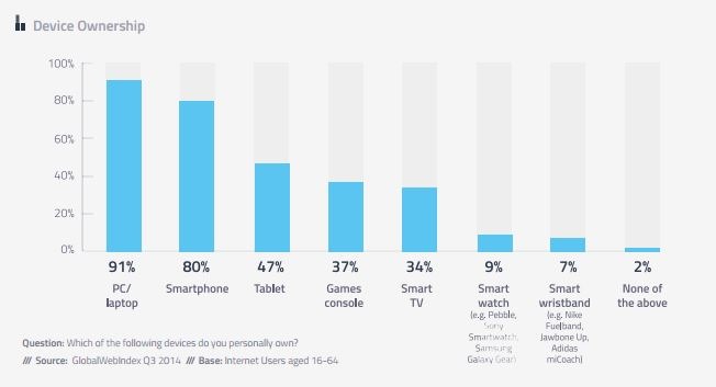
Today, 80% of internet users own a smartphone (iPhone or equivalent), and tablet ownership is at 47%. The way interact with the internet has evolved very quickly, and a lot of businesses and website owners are still struggling to keep up with this shift.
Read on to discover what responsive web design is and why it’s so important.
Before Responsive Design
Traditional “Fixed” Websites
The very first website went live in 1991 and since then, web design has come a long way (see the rapid growth of web design: past to present). Before smartphones and tablets, the only way to surf the web was via a desktop computer.
This made things easy for web designers, because they knew the size of the screen people were using. Okay, so there may have been a few variations, but the majority of desktop screens followed the traditional square/rectangular monitor that were similar in size; making website design as easy as 1,2,3:
- Graphic designer creates website design that is a fixed size.
- Web developer codes the website turning the design into a fully functional website.
- Website is launched, looks great, works great, and the process is complete.
Standalone Mobile Websites
Then came the smartphone, and nobody was ready.
A traditional fixed width website will still render on smaller devices, but can be hard to read. The page and content will distort, the text will be small and hard to read, and sometimes the whole website would ‘break’ entirely.
Website designers, developers and business owners alike cursed the smartphone, but quickly came up with a solution: standalone mobile websites. Put simply, a standalone mobile website is a duplicate of the original website, specifically optimised for a smaller screen.
As the mobile industry increased in popularity, web designers began designing mobile versions of websites in order to let mobile users enjoy web content easily and quickly. Many website owners invested in a mobile version of their website, and everyone was happy.
But the mobile industry just kept growing and growing. Today, 80% of all online adults now own a smartphone, while almost 50% have a tablet.

Image: GlobalWebIndex
With more devices comes varying screen resolutions, definitions and orientations. New devices with new screen sizes are being developed every day, and each of these devices may be able to handle variations in size, functionality and even colour. Some are in landscape, others are in portrait, still others even completely square.
What’s the solution? Developing more and more versions of your website optimised for all these different screen sizes? The “quick-fix” response to create mobile websites is just no longer practical. That’s where responsive web design comes in.
So, What is Responsive Web Design?
Put simply, responsive web design is a technique for building websites that work on all mobile devices, tablets and desktop screens; responding and adjusting automatically to the screen size and resolution of each individual device. For example, if a user was to switch between their laptop and their smartphone, the website should automatically adapt to accommodate for resolution, image size and scripting abilities (Aptitude’s website is an example of responsive design in practise, resize the page now to see how it responds).

This eliminates the need for a different design and development phase for each new device on the market (which would be impossible).
A site layout example that adapts to browser viewpoint width was first demonstrated by Cameron Adams in 2004. But it was Ethan Marcotte who coined the term responsive web design in a May 2010 article in A List Apart:
“Rather than tailoring disconnected designs to each of an ever-increasing number of web devices, we can treat them as facets of the same experience. We can design for an optimal viewing experience, but embed standards-based technologies into our designs to make them not only more flexible, but more adaptive to the media that renders them. In short, we need to practice responsive web design.”
The practice consists of three main principals that come together to form a responsive website:
- Flexible grids and layouts – responsive websites are built with relative units (like percentages) rather than fixed units (pixels).
- Fluid images – images should be able to resize themselves accordingly.
- Media queries – a core component of responsive design, media queries allow CSS to only be applied when specific conditions are met, such as a specific width.
Read Kayla Knight’s article on Smashing Magazine for detailed examples of how to code responsive websites.
Why You Should Make the Switch: 5 Benefits of Responsive Web Design
1. Mobile usage is continue to keep rising
Increasing use of the internet via a range of varying mobile devices has been the driving force of responsive design. A 2014 report by Exact Target found that 85% of respondents said mobile devices are a central part of everyday life – and 90% of those aged 18-24 agreed.
The younger generations are the driving force behind the rise in mobile usage, claiming in the same report that mobile devices allow them to stay up to date with loved ones and social events. Mobile technology has allowed us to have the whole of the internet available to us at any time, and the introduction of 3G and 4G have enabled smartphones and tablets to be faster and better.
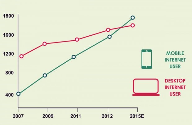
In 2014 it was predicted that mobile internet usage would overtake desktop; that prediction has now become a reality.

Image: Visua.ly
2. Recommended by Google
Responsive web design, i.e. sites that serve all devices on the same set of URLs, with each URL serving the same HTML to all devices and using just CSS to change how the page is rendered on the device. This is Google’s recommended configuration.
Google publically recommends that websites use a responsive approach where possible. Google says it’s more efficient to have one website and URL, and that it makes it easier for Google to crawl and index your site.
Google also prefers responsive web design because content that lives on one website and one URL is easier for users to share, interact with, and link to than content that lives on a separate mobile site.
3. Better User Experience
A site that works well on every device type and size will provide a better and more consistent user-experience. Have you ever visited a website on a mobile and had to pinch and zoom to see the page properly?
48% of users stated to Google that when a site doesn’t function on their mobile device it makes them feel that the company does not care for their business (Huffington Post).
A site that hasn’t been optimised for mobile – whether responsive or standalone mobile – will experience a high bounce rate. A negative experience with a website like this can turn against your brand/business and stop them from pursuing your services in the future; 57% of users won’t recommend companies with poor mobile sites.
4. Strengthens SEO
By creating a single website instead of multiple mobile versions, the URL structure remains the same across all devices, improving your ranking and search engine visibility of the site. This is because you’re eliminating the risk of duplicate content, as well as ensuring any links gained to your website are the same whether through mobile or desktop.
What’s more, Google has said that it ranks sites optimised for mobile higher in mobile searches.
Google’s Matt Cutts also gave his input, saying:
“In general, I wouldn’t worry about a site that is using responsive design losing SEO benefits because by definition you’ve got the same URL. So in theory, if you do a mobile version of the site, if you don’t handle that well and you don’t do the rel=canonical and all those sorts of things, then you might, in theory, divide the PageRank between those two pages.”
5. Your competition has already made the switch, and it’s making you look BAD
2013 was dubbed the year of responsive design. That was 3 YEARS AGO. Since then, website owners everywhere have been making the switch, and you’re already lagging behind and potentially losing business because of it.
Today, if your business hasn’t been optimised for smartphones and tablets, it makes your business look bad. While everyone else has made the effort to make things easier for their customers, your business will either look old-school (not in the good way), cheap or like you don’t care about your customers.
It’s a harsh reality, but it’s the reality you must accept.
Where is Responsive Web Design Leading Us? A Look at Responsive Logos
Responsive web design is not only about adjustable screen resolutions and automatically resizable images, but rather about a whole new way of thinking about design.
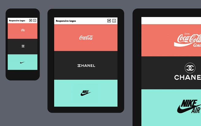
Designer Joe Harrison showed us how well-known brands could adopt responsive logos in the near future.

Dan Gardner and Mike Treff discussed the future of responsive design in more depth their article in Fast Company;
Today, users expect online experiences that not only respond to what device they’re using, but also their location, time of day, what they’ve already read, and events happening in real time.
They say that brands and businesses need to change their entire organisation's culture, process and technology and develop a responsive philosophy that allows them to adapt to users so they can reach them at the right time, with the right messages. This might seem like a far-out idea to some, but this is already beginning to happen and has the potential to develop quickly over the next few years.
Conclusion
I’ve presented you with the facts and data showing the important and major impact of mobile technology on the way we use the internet. Businesses who continue to ignore the fact that mobile usage is the way forward, stand to lose out to competitors who have already embraced the switch and taken action to keep themselves present in the fast-paced, dynamic age of mobile technology.
Responsive websites are currently the most effective way of tackling the problem of multiple device usage. The majority of established businesses have already made the switch, but smaller businesses are being left behind and this is having a negative impact on their online (and offline) campaigns.
Have something to say? Comment below or tweet us at @Aptitude to let us know if you agree with us or not. Contact us to discuss your responsive website.


